Chromatic Authority: Mastering the Color Codes of Velvet for Refined Dressing
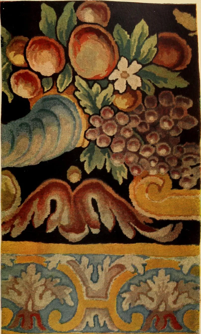
Photo: Internet Archive Book Images, No restrictions, via Wikimedia Commons
There is a peculiar tension embedded within velvet. Of all the luxury textiles available to the discerning dresser, none carries quite the same paradoxical weight: a fabric so inherently rich, so unabashedly sensual in its construction, that the colors chosen to render it can either elevate a garment to wearable art or reduce it to theatrical excess. Velvet does not whisper. It speaks with the full resonance of its pile, and the color you select determines whether that voice commands respect or invites scrutiny.
This is the chromatic challenge that separates those who wear velvet from those who are worn by it.
Why Velvet Behaves Differently Than Any Other Fabric
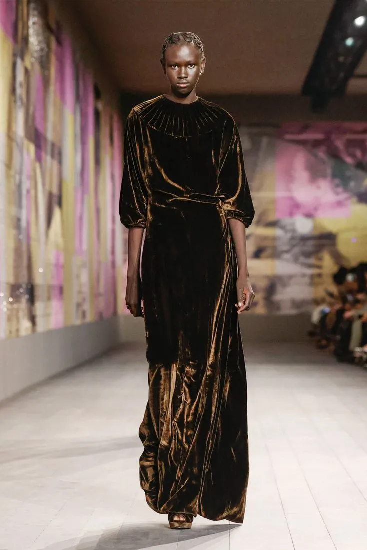
Before one can understand how color operates within velvet, it is essential to appreciate what makes this textile's relationship with light so singular. The cut pile of velvet — thousands of upright fibers that catch and deflect illumination at varying angles — means that no velvet garment reads as a single, static color. A deep sapphire blazer will appear almost black in shadow and reveal brilliant cobalt where light grazes the surface. A burgundy gown shifts between plum, crimson, and near-brown depending on the viewer's position and the quality of the surrounding light.
This phenomenon, known as the "play of light" unique to pile fabrics, multiplies the visual intensity of any color by a significant degree. What might read as a muted, composed hue in silk or wool becomes dramatically amplified in velvet. The practical implication for the sophisticated dresser is straightforward: restraint in color selection is not timidity — it is an act of deliberate intelligence.
The Authority of Deep Jewel Tones
Among the most enduring color choices for velvet in American luxury dressing are the deep jewel tones: emerald, sapphire, amethyst, and garnet. These colors succeed in velvet not because they are conservative, but because they possess an internal logic that aligns with the fabric's own visual complexity.
Deep jewel tones work with velvet's light-play rather than against it. A rich emerald, for instance, does not flatten under velvet's pile — it deepens, revealing a spectrum of forest greens and shadowed teals that no single swatch could predict. The result is a garment that appears to have genuine visual depth, an impression of dimensionality that reads as sophistication rather than showmanship.
For those navigating formal occasions — charity galas, corporate dinners, or the elevated social calendar that defines affluent American life — a jewel-toned velvet blazer or evening jacket represents one of the most reliable expressions of considered luxury. It makes a statement without requiring explanation.
The Unexpected Elegance of Velvet Neutrals
Perhaps the more counterintuitive discovery awaiting those who explore velvet's full chromatic range is the extraordinary performance of neutrals. Champagne, deep ivory, warm taupe, slate gray, and even a carefully chosen blush can achieve something remarkable in velvet: they transform a fabric associated with drama into an instrument of quiet authority.
This is not the neutrality of safe choices or aesthetic cowardice. Velvet neutrals succeed because they allow the fabric's structural beauty — the movement, the sheen, the tactile invitation — to become the primary statement. The color recedes just enough to let the textile speak for itself. In an era when American luxury dressing increasingly prizes understatement over ostentation, a champagne velvet evening coat or a slate-gray velvet suit jacket carries a confidence that brighter choices sometimes undermine.
The most sophisticated wardrobes often contain at least one velvet piece in this register — a garment that reads as effortlessly elegant precisely because it does not appear to be trying.
Colors That Demand Caution
If deep jewel tones and refined neutrals represent velvet at its most authoritative, there are chromatic territories that warrant genuine consideration before commitment. Highly saturated primaries — electric blues, neon-adjacent greens, vivid oranges — can overwhelm velvet's natural complexity, producing a visual result that reads as costume rather than clothing. The fabric's amplifying quality, so advantageous with deeper or more muted hues, becomes a liability when the color itself is already shouting.
Bright red is perhaps the most instructive case study. In silk or crepe, a red gown can achieve effortless glamour. In velvet, the same red risks tipping into pantomime territory — the pile intensifying the color to a saturation level that crowds out nuance entirely. This does not mean red velvet is categorically inadvisable; it means that the specific shade of red requires extraordinary care. A deep wine red, a brick-toned burgundy, or a shadowed crimson will perform with considerably more elegance than a fire-engine primary.
Building a Color Strategy for Your Velvet Wardrobe
For the affluent American consumer approaching velvet with the seriousness the fabric deserves, a color strategy is as essential as quality assessment. Consider the following principles when evaluating a velvet acquisition:
Depth over brightness. Favor colors with inherent depth — hues that contain visual complexity even before velvet's pile adds its own dimension. A color that appears multifaceted on a swatch will be extraordinary in velvet.
Test under multiple light sources. Given velvet's sensitivity to light conditions, evaluate any potential purchase under both warm incandescent light and cooler natural or LED light. The color you see in a boutique's carefully curated lighting may shift substantially in the real environments where the garment will be worn.
Consider the occasion's visual register. Black-tie environments, where candlelight and ambient warmth prevail, reward deeper, richer colors. Daytime or well-lit settings may allow for somewhat lighter velvet neutrals without sacrificing the fabric's inherent gravitas.
Resist the seasonal pressure toward novelty. Fashion's seasonal color cycles are designed for fabrics that can absorb trend without consequence. Velvet's permanence and investment value mean that a color chosen for longevity — a classic midnight navy, a timeless forest green — will serve the wardrobe for decades rather than seasons.
The Deeper Principle
At its core, the color psychology of velvet returns to a fundamental truth about luxury dressing: the most powerful garments are those in which every element serves the whole. In velvet, color is not decoration applied to a neutral ground — it is a co-author of the garment's meaning. Choose it with the same deliberate attention you would bring to any significant acquisition, and velvet will reward that seriousness with a presence that no other fabric in your wardrobe can quite replicate.